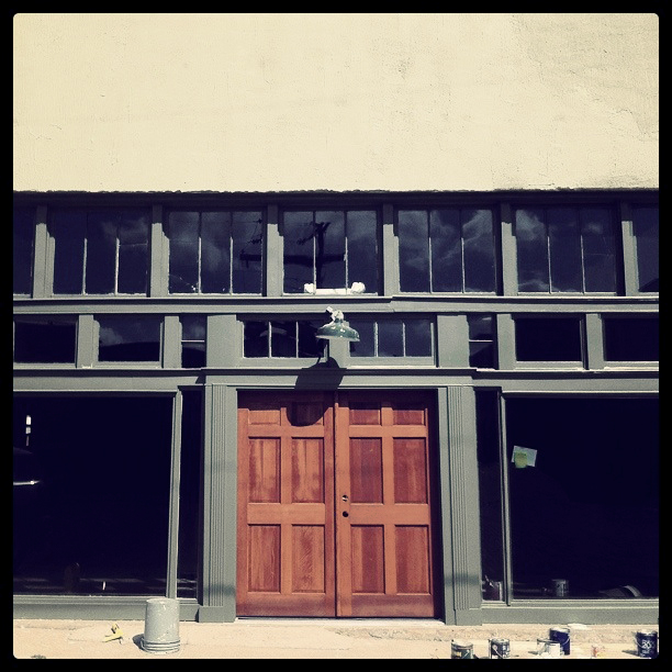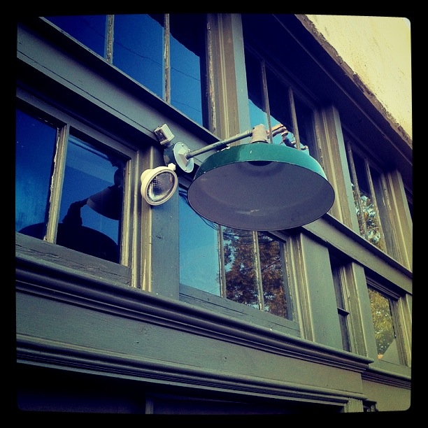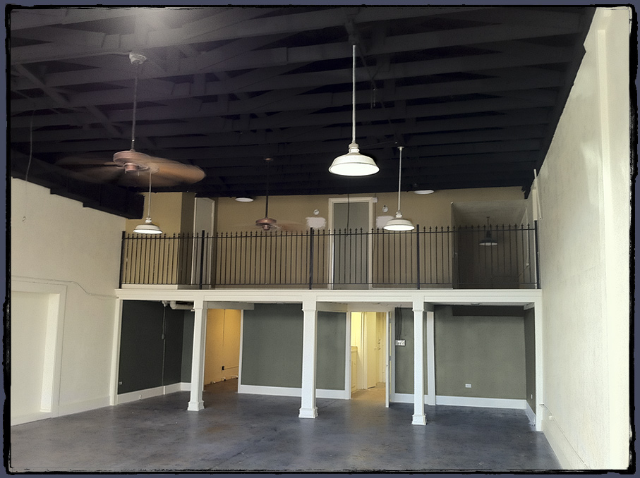
New facade
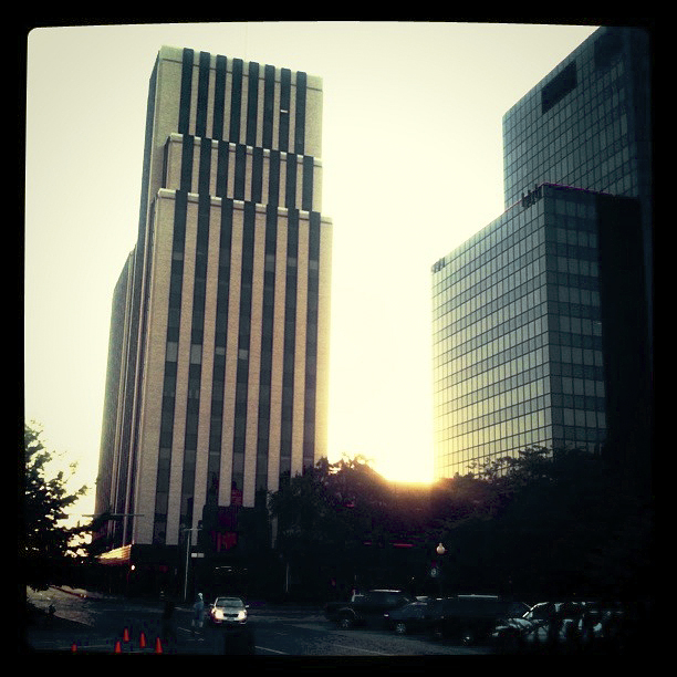
Actually only 1 block North – into the quaint, renovated, historic area known as downtown Tyler. Those of you who know us will probably agree, this is so right for us. Our bent on nostalgia has been a part of the brand since the early days.
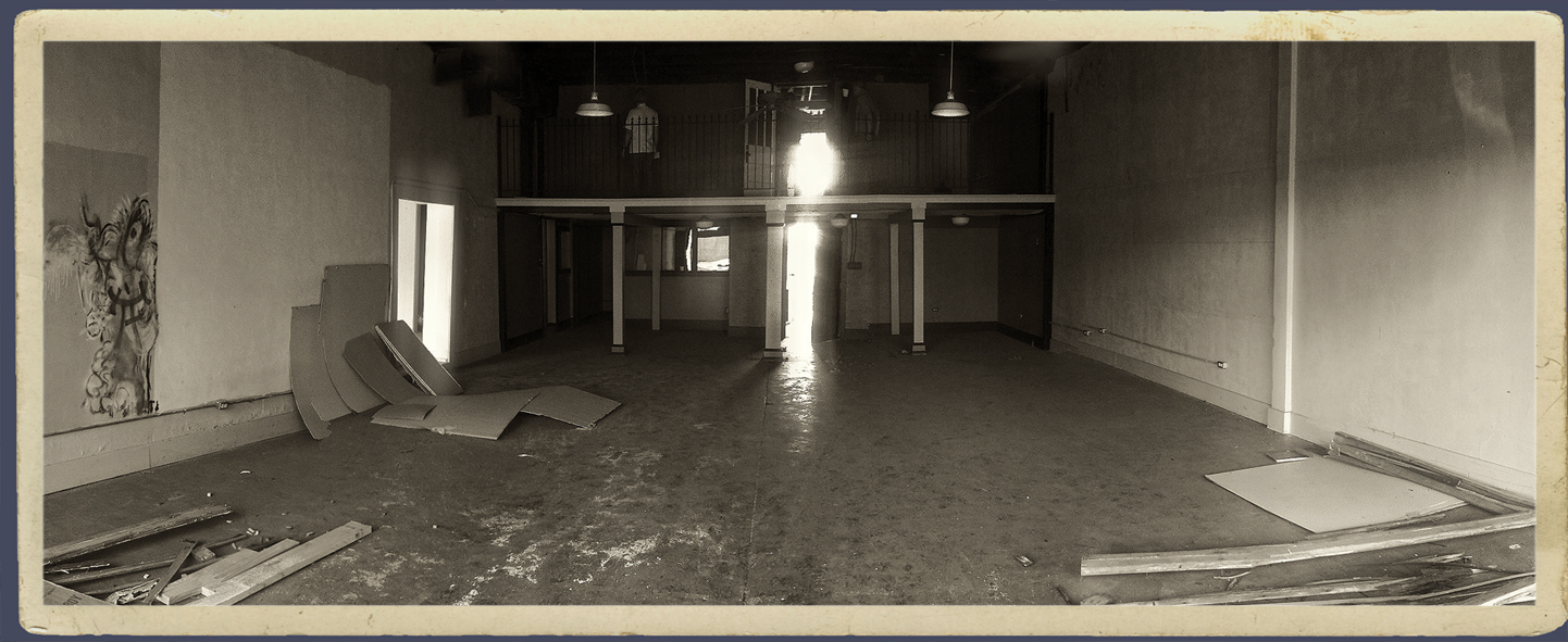
Some of you might remember we had office space downtown in the early 90’s before moving into an old house on Bois d’arc (in ’93) and later to Fannin Street. This space, however, is the first to have that classic, downtown design studio appeal: 1930’s storefront, concrete floors, cavernous interior, 14″ ceiling with a loft.
As much fun as it might be to write a long blog on this topic, a quick photo-journal seems more expedient (1 pic > 1 thousand words). These semi-crude Instagram/iPhone 4 (need that 4s) snaps were taken over the past 6 months during the restoration and build-out of the new space.
Open House in planning. It’s going to take us a few months to settle in but after we get this space properly junked up with old signs memorabilia, drafting tables, file cab’s and… otherwise – office crap, we’ll invite you guys to an open house. Anyone remember the open house in 1996?

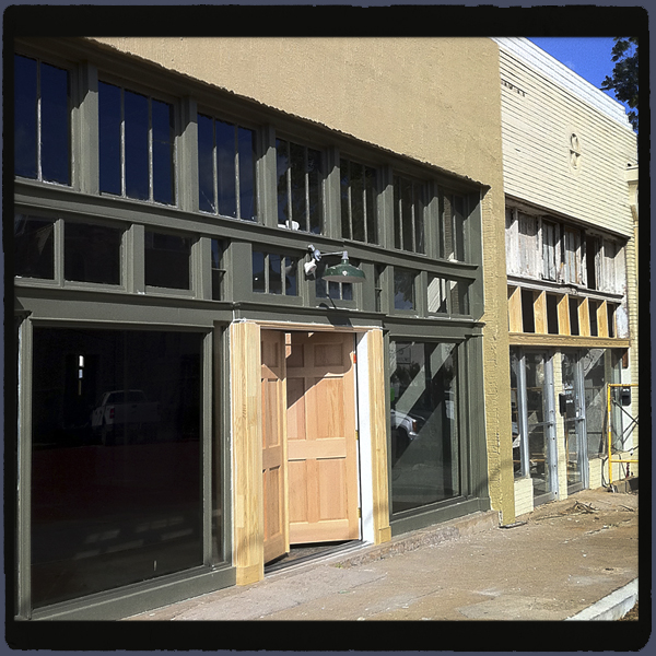
Original double doors, Un-salvageable. Note - green paint test swatch.

Rough. Great potential.

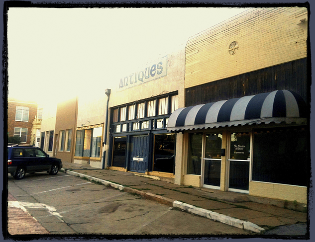
View looking at all the connecting storefronts. Pre-renovation.

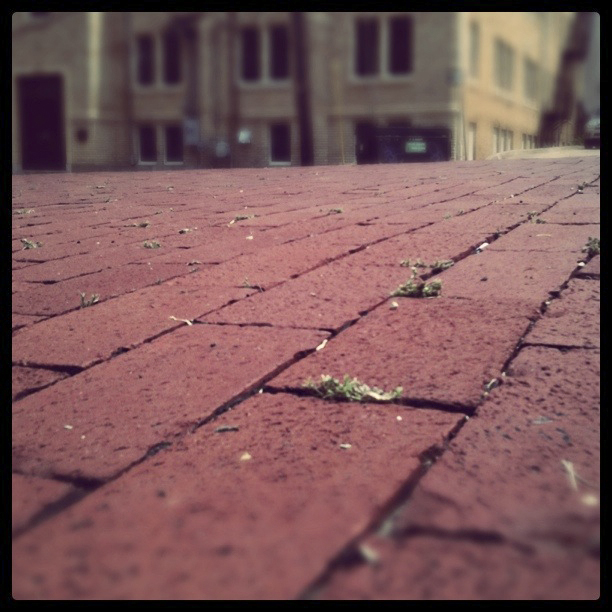
We are huge fans of Tyler's red brick streets.

Another view. Signage for HIW comes next.

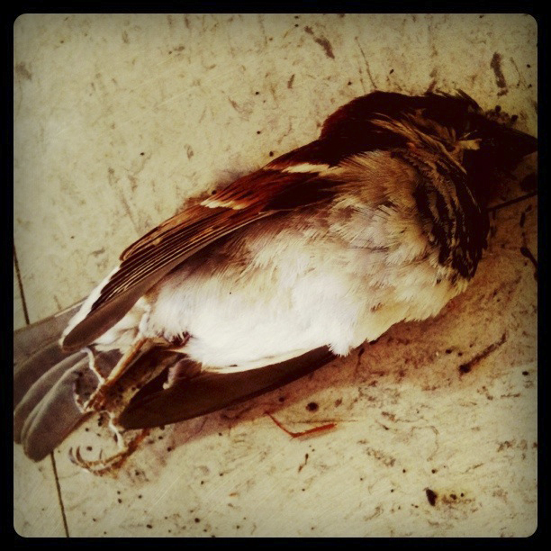
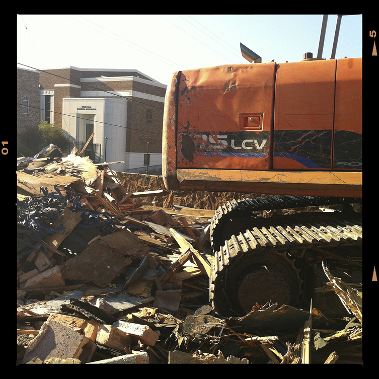
When we said "rough", we meant "there were dead birds & critters inside". RIP sparrow.

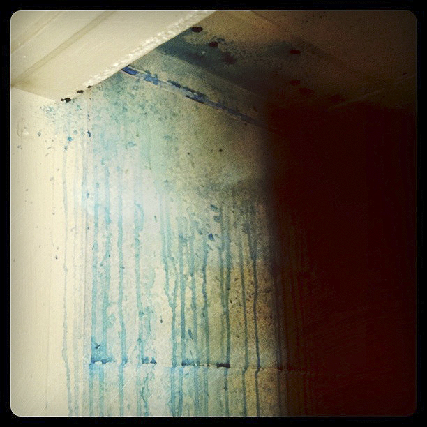
Previous paint job on restroom wall. Sick.

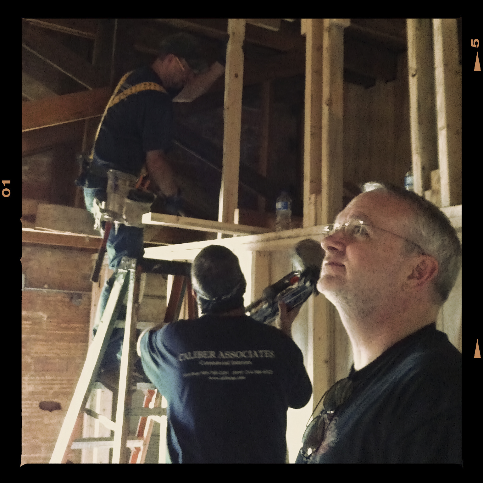
Upstairs build-out (copywriter/marketer - Bill Ferrell's office). Craig takes gander at progress.

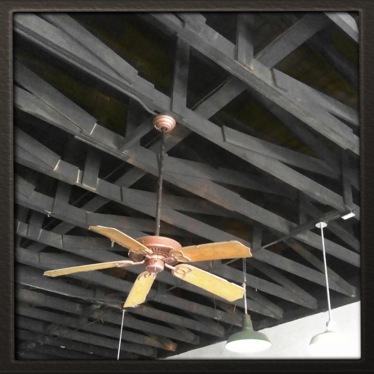
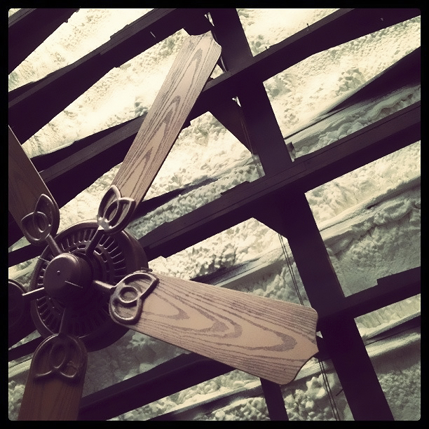
Exposed rafters. YES. But there was no insulation. NOT cool.

Flumulin (insulation) was blown in to remedy problem. Flumulin is a bonafied, made-up word.

Painters mask off fans to spray black paint over Flumulin.

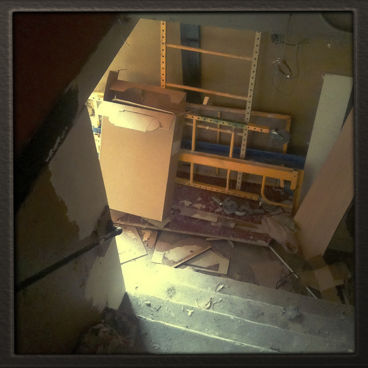
Dangerous, dark stairwell (before).

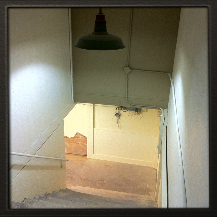
Safe stairwell (after).

One of many relics we will drag up to the new space.

Goobery artist surmises progress in wonderment.

100% US grade, aged, Grunge-Crete.

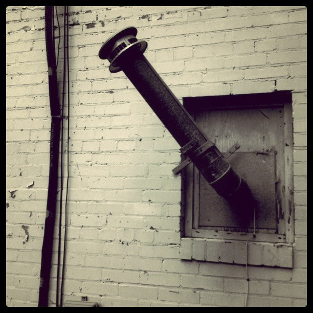
Interesting crooked pipe thing 'round back.

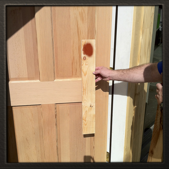
Picking a nice, eye-catching door stain.

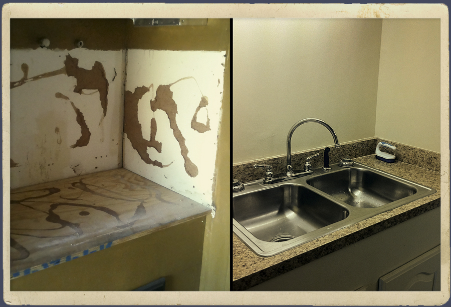
Coffee Bar (some prefer the term 'Kitchen')
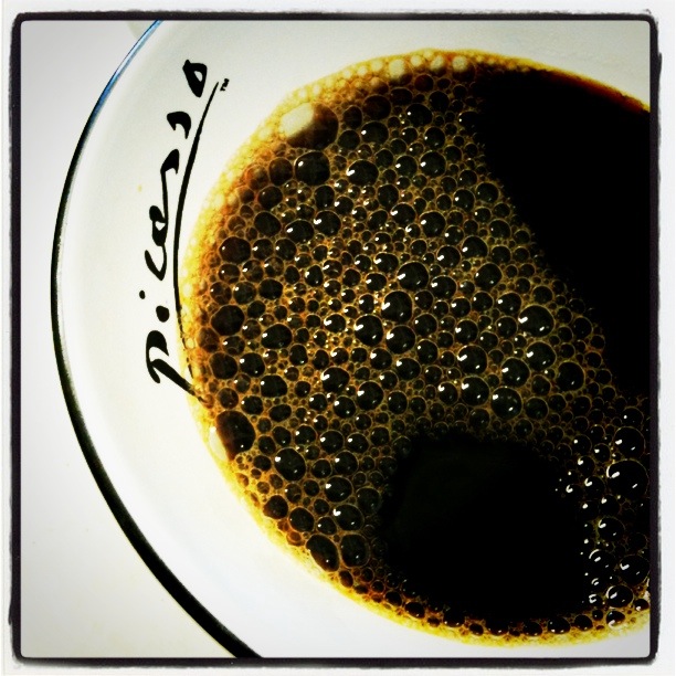
coffee. Picasso did.”]

Speaking of... stop by any time for a cup on us. Picasso did.

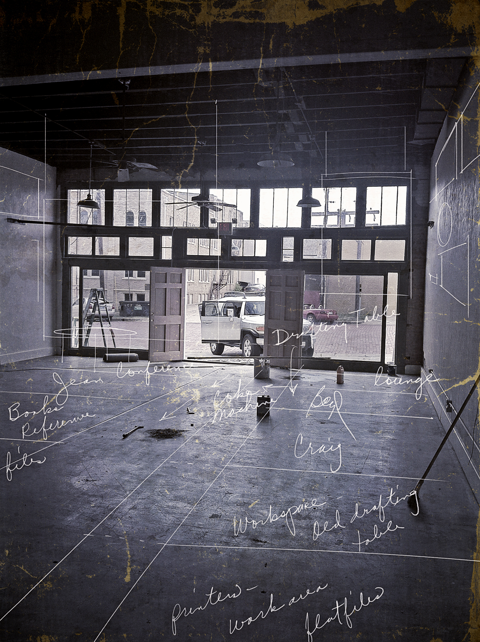
Sketch overlay - rough idea for dividing up space.

They built us a nice parking lot in the back.

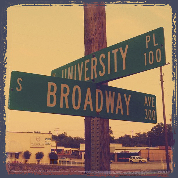
Heading N toward downtown, turn L on University Pl. after Front St.

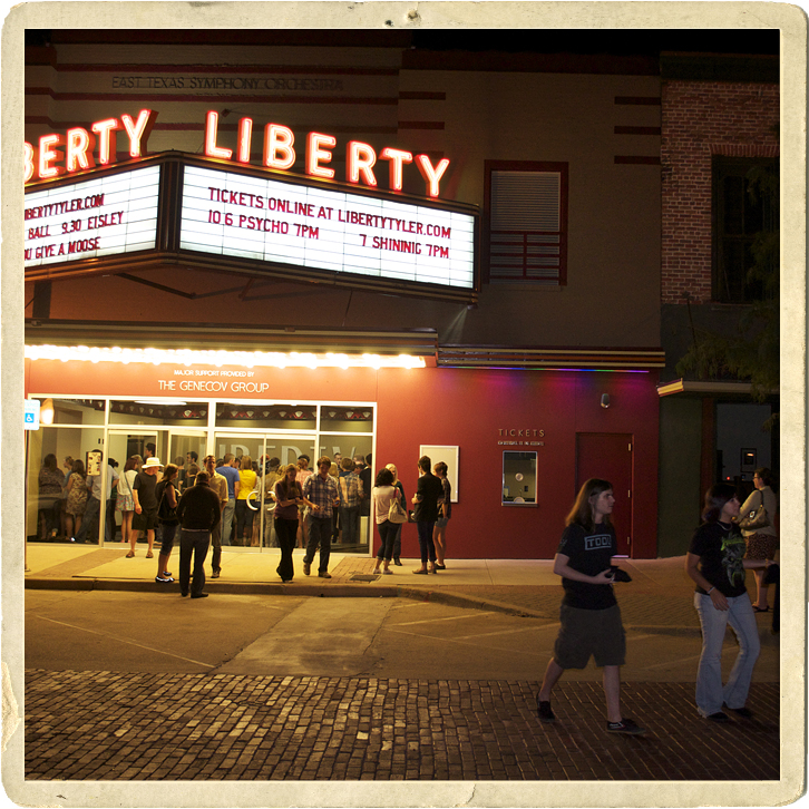
We're a few blocks from Ricks, Don Juans, Downtown Coffee Shop, The Liberty, etc.

Who said our downtown wasn't cool. Eisley show at the Liberty last week.

Final clean up. He seals the floor next.

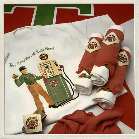
From our 1996 open house. This design is in Graphis Packaging 7.

Slouching Painter prepares to stain doors as new tenants heckle from on high.

Flat overhang/awning to be installed next wk (for when it rains).

Space. The final frontier.
Enough images. Be thankful since we had over 7 gbs worth on our iPhones. We’ll keep you posted. Thanks.
bd 19.14.11 5:38am
p.s. how many of you found our blog because of the e-blast we sent out? Just curious.
