June 24, 2013
Hello readers, friends, clients. It’s been awhile. There are two reasons Hanson ImageWorks has been slow to blog. 1.) We didn’t want to preempt the splendor of an open house with pic previews 2.) Business and busy-ness have dominated. We’ve been too busy to plan an open house. Considering the present economy, that’s good but we need to follow our own advice. We all need to blog for SEO purposes no matter what’s going on internally.
So, here’s to not worrying about an open house. Here’s to a new era of blogging. We’re picking back up where we left off in our last post beginning with moving in and ending w/ a few pics of our now-not-so-new offices!

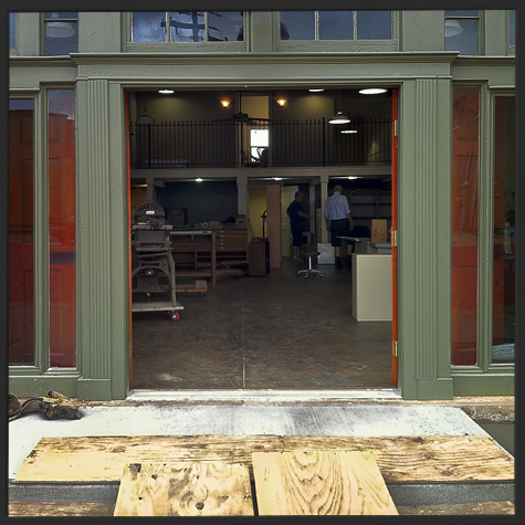
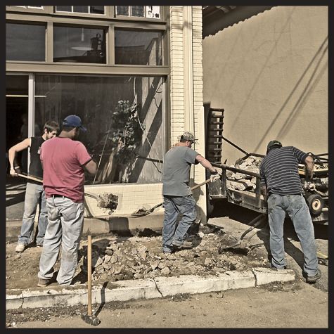
Right before we moved in, the sidewalk was falling apart and there were no ramps. No longer.

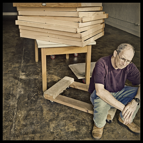
This was taken on our official move-in day. The concrete for the sidewalk was wet. We utilized ghetto ramps to avoid that whole ‘yank — buh-dump’ thing with the dolly. Worked like a charm.

On the day we moved, our resident marketing/copy-writing guru, Bill Ferrell, was terribly sick.

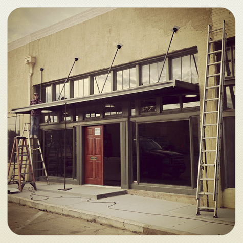
The move took a day. There was much more to do. Like installing an awning on the facade.

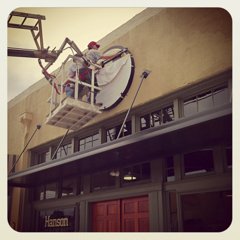
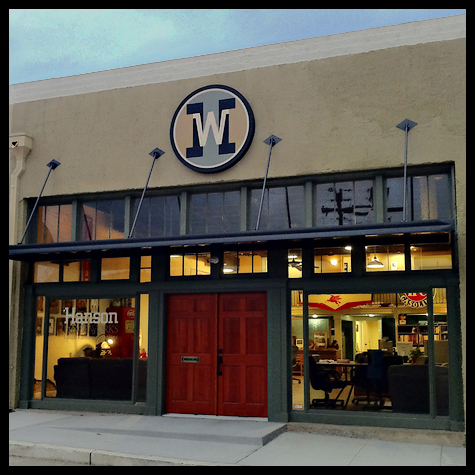
… and getting a sign… our logo, on the facade.

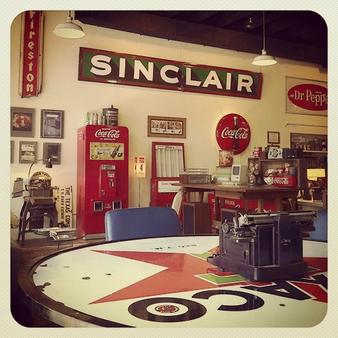
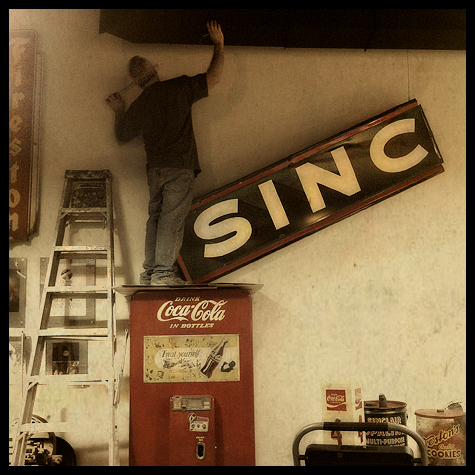
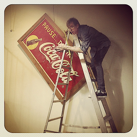
Inside we began decorating. Here, Craig engineers the hanging of ancient signage.

Boyd, less assured, attempts to mimick Craig’s sign hanging process.

A work in progress. View of one of our ever-changing, emergent walls from the conference table. The new space became our new 3d canvas.

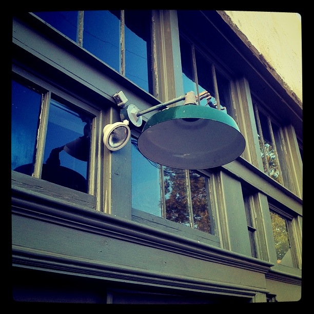
The new facade w/ signage at dusk.

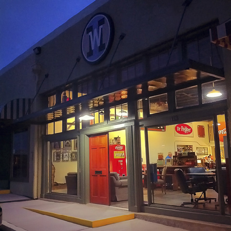
The new facade at night… sans outside lights.

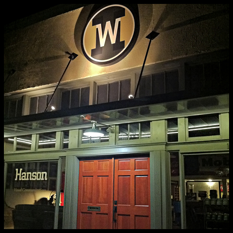
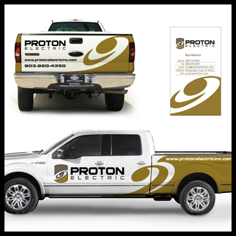
The illuminated facade…thanks to Proton Electric.

Speaking of Proton Electric, they’re also a client. See their identity, branding and website.

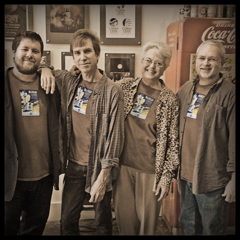
Hanson Image Works – Ronnie Mason/web developer/designer, Boyd DuPree Designer/Art director, Jean Coake/accountant, Craig Hanson/designer/head hancho (left to right). Since this image was taken, we’ve added Greg Bailey, Project manager/Sales and Donny Daniell, Pre-Press & Print Specialist
to our roster!
You’ve now seen a glimpse of our new space. Please stop by anytime for a closer look, some hang-out time and an ice cold Coke from one of our vintage machines if you’d like. We’d love to talk about any upcoming design projects or marketing problems you might be facing. Thanks!
– Hanson ImageWorks
October 12, 2011

New facade
Actually only 1 block North – into the quaint, renovated, historic area known as downtown Tyler. Those of you who know us will probably agree, this is so right for us. Our bent on nostalgia has been a part of the brand since the early days.
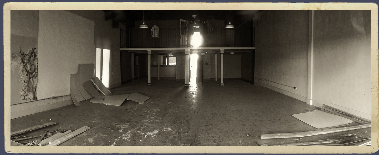
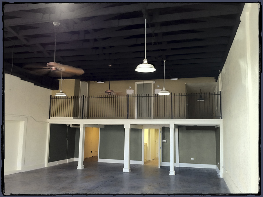
Some of you might remember we had office space downtown in the early 90’s before moving into an old house on Bois d’arc (in ’93) and later to Fannin Street. This space, however, is the first to have that classic, downtown design studio appeal: 1930’s storefront, concrete floors, cavernous interior, 14″ ceiling with a loft.
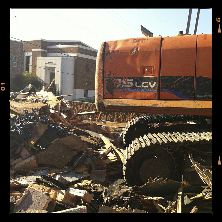
As much fun as it might be to write a long blog on this topic, a quick photo-journal seems more expedient (1 pic > 1 thousand words). These semi-crude Instagram/iPhone 4 (need that 4s) snaps were taken over the past 6 months during the restoration and build-out of the new space.
Open House in planning. It’s going to take us a few months to settle in but after we get this space properly junked up with old signs memorabilia, drafting tables, file cab’s and… otherwise – office crap, we’ll invite you guys to an open house. Anyone remember the open house in 1996?

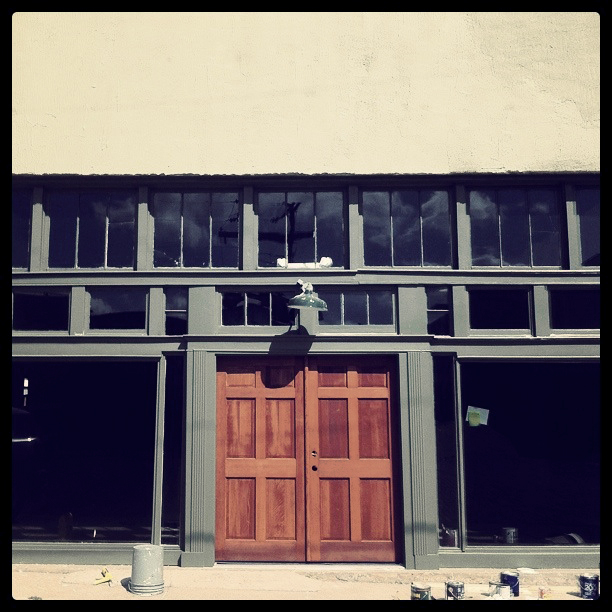
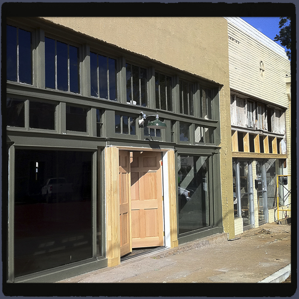
Original double doors, Un-salvageable. Note - green paint test swatch.

Rough. Great potential.

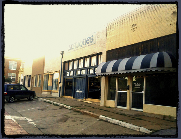
View looking at all the connecting storefronts. Pre-renovation.

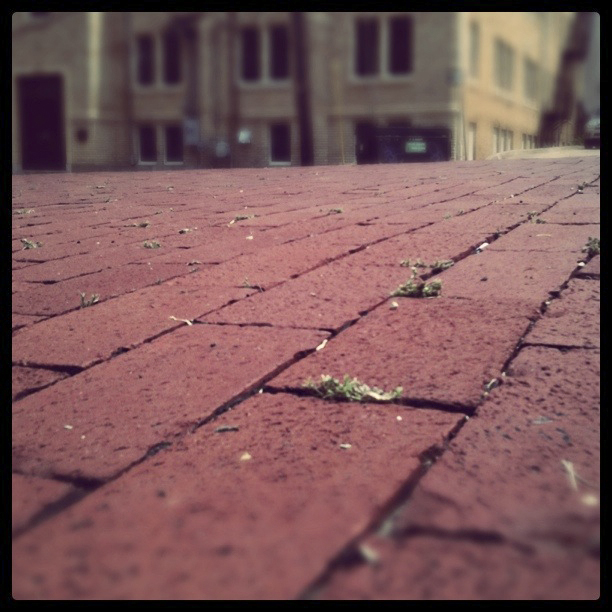
We are huge fans of Tyler's red brick streets.

Another view. Signage for HIW comes next.

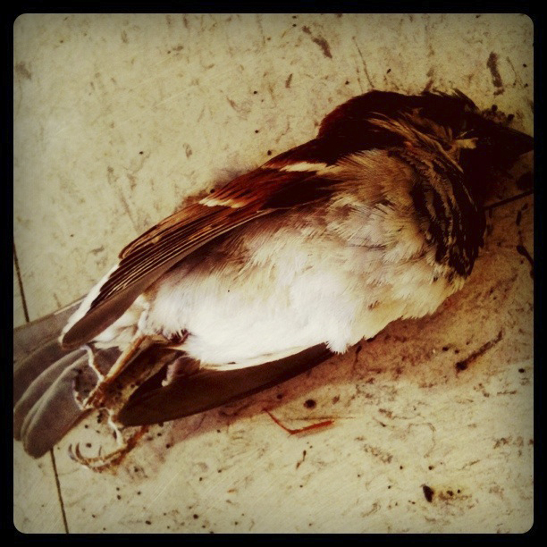
When we said "rough", we meant "there were dead birds & critters inside". RIP sparrow.

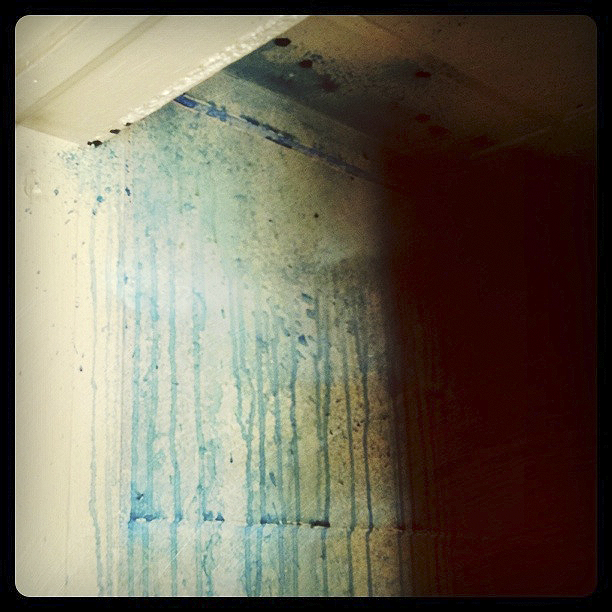
Previous paint job on restroom wall. Sick.

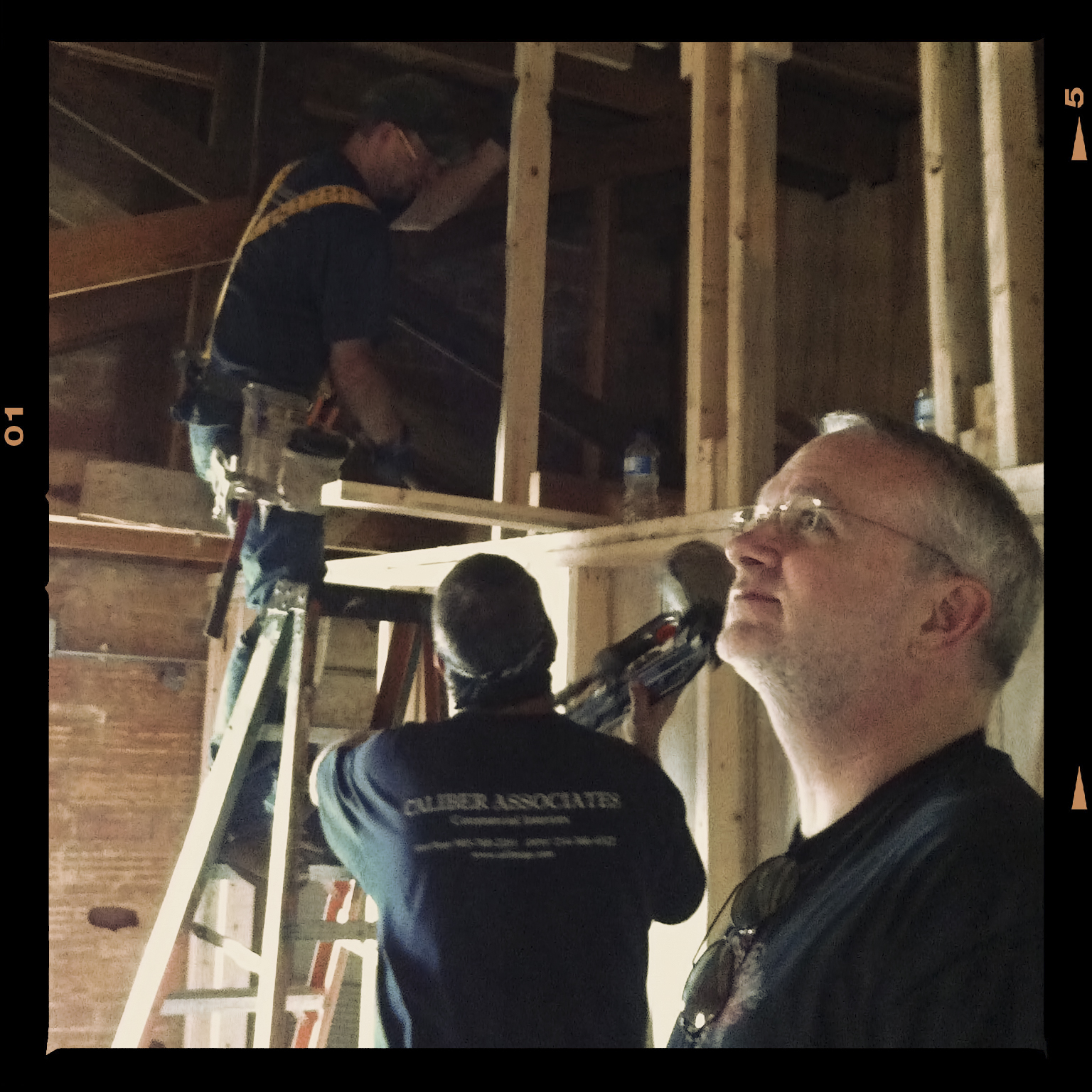
Upstairs build-out (copywriter/marketer - Bill Ferrell's office). Craig takes gander at progress.

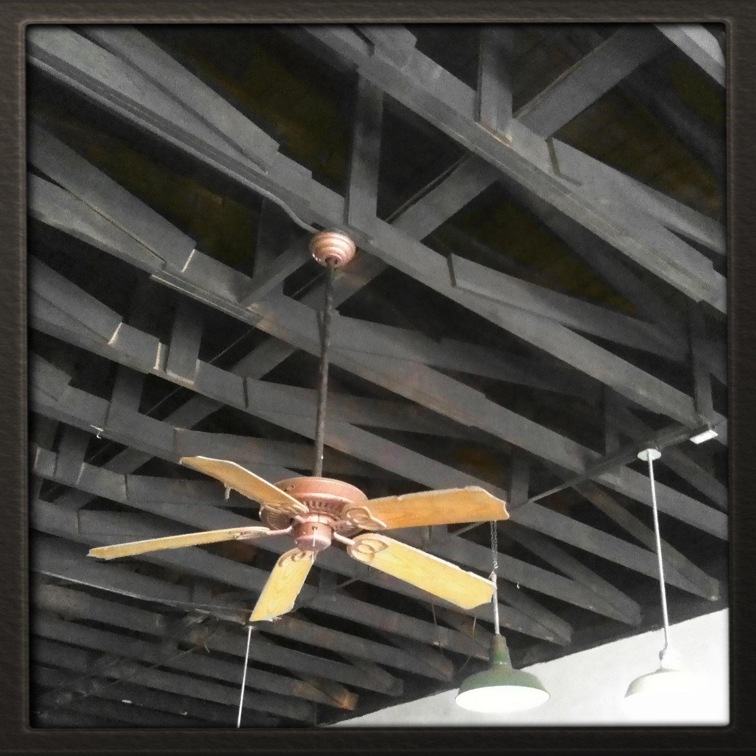
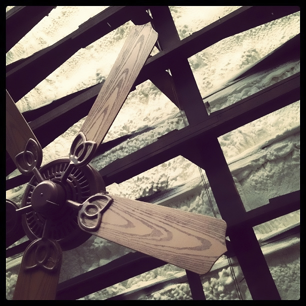
Exposed rafters. YES. But there was no insulation. NOT cool.

Flumulin (insulation) was blown in to remedy problem. Flumulin is a bonafied, made-up word.

Painters mask off fans to spray black paint over Flumulin.

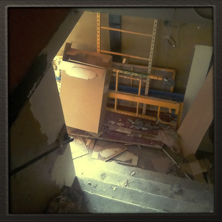
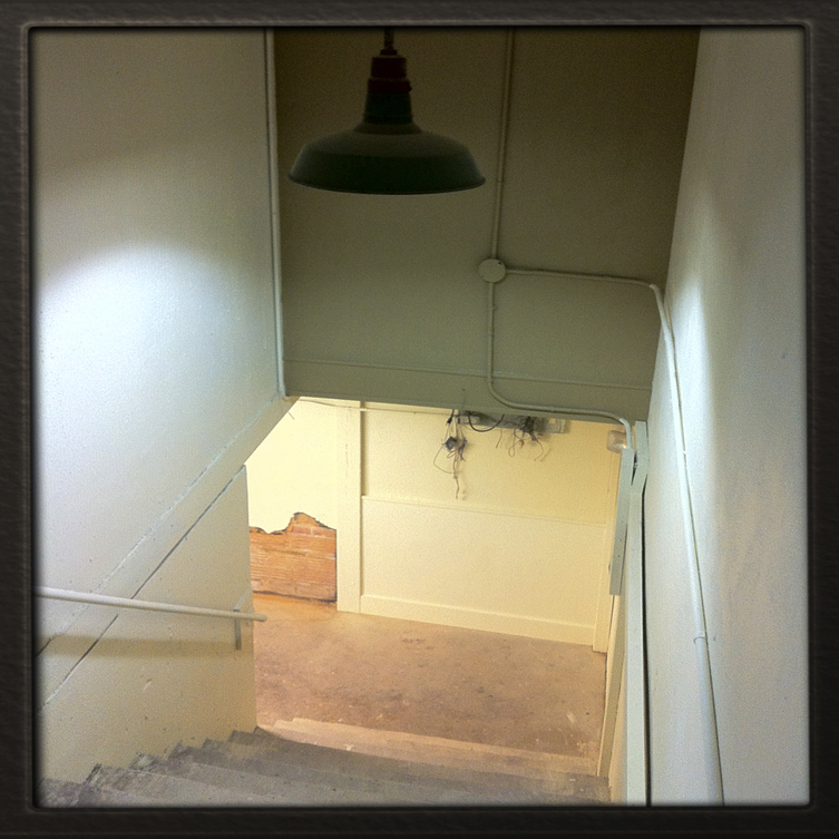
Dangerous, dark stairwell (before).

Safe stairwell (after).

One of many relics we will drag up to the new space.

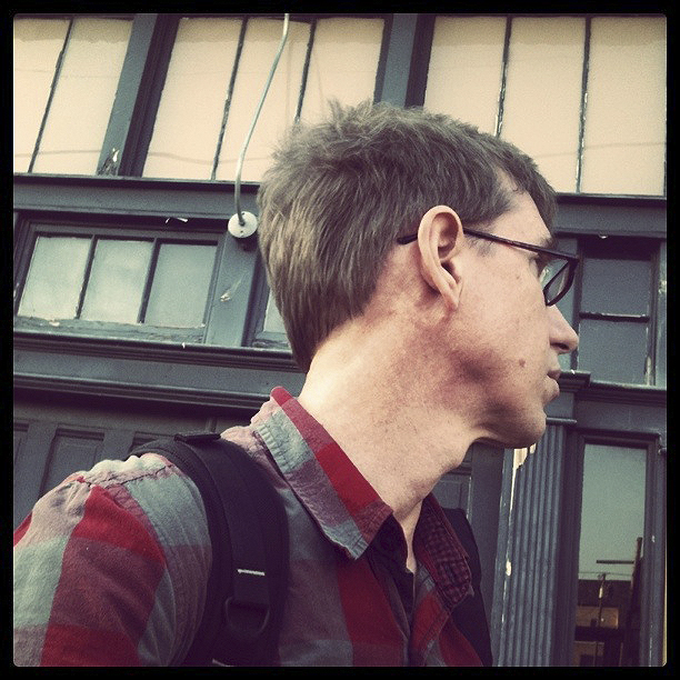
Goobery artist surmises progress in wonderment.

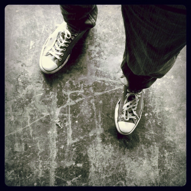
100% US grade, aged, Grunge-Crete.

Interesting crooked pipe thing 'round back.

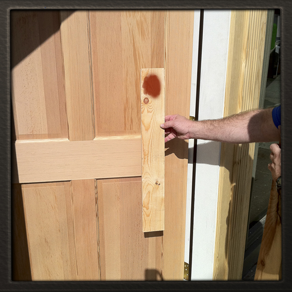
Picking a nice, eye-catching door stain.

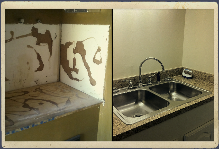
Coffee Bar (some prefer the term 'Kitchen')
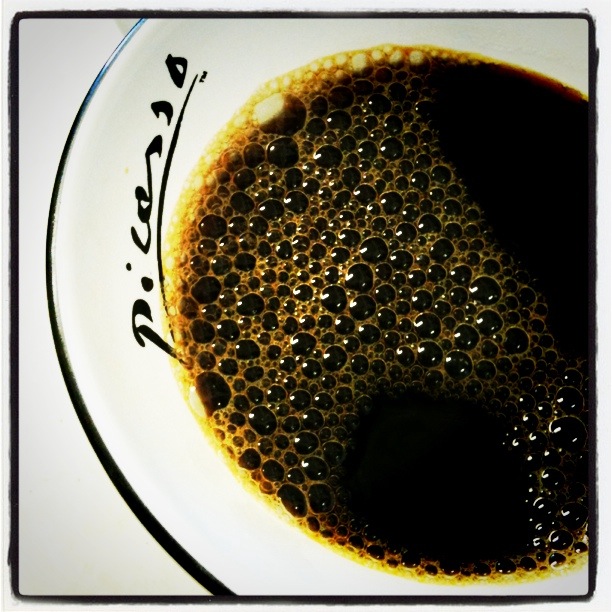
coffee. Picasso did.”]

Speaking of... stop by any time for a cup on us. Picasso did.

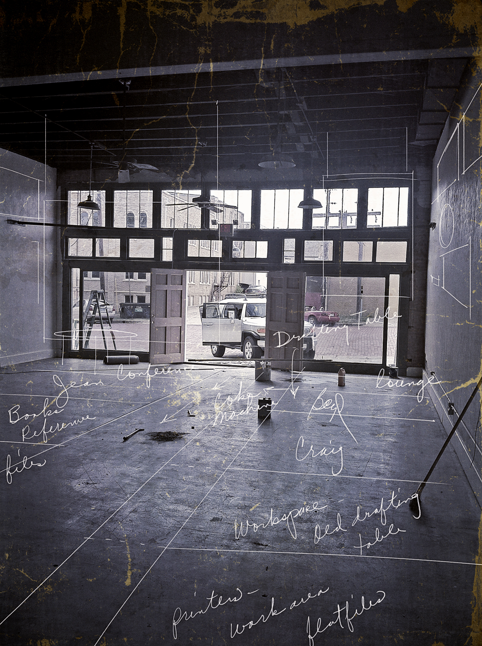
Sketch overlay - rough idea for dividing up space.

They built us a nice parking lot in the back.

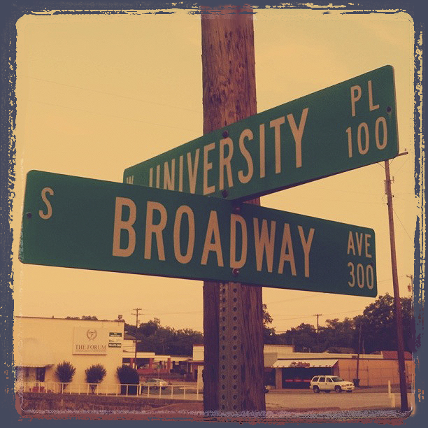
Heading N toward downtown, turn L on University Pl. after Front St.

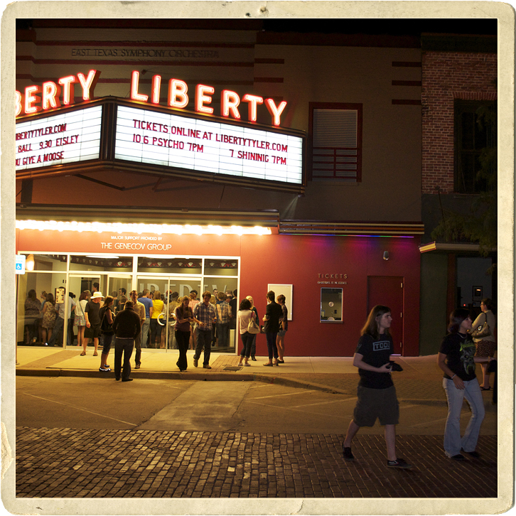
We're a few blocks from Ricks, Don Juans, Downtown Coffee Shop, The Liberty, etc.

Who said our downtown wasn't cool. Eisley show at the Liberty last week.

Final clean up. He seals the floor next.

From our 1996 open house. This design is in Graphis Packaging 7.

Slouching Painter prepares to stain doors as new tenants heckle from on high.

Flat overhang/awning to be installed next wk (for when it rains).

Space. The final frontier.
Enough images. Be thankful since we had over 7 gbs worth on our iPhones. We’ll keep you posted. Thanks.
bd 19.14.11 5:38am
p.s. how many of you found our blog because of the e-blast we sent out? Just curious.
September 27, 2011

The City of Tyler approached local designers in May about their need to re-brand Tyler. We submitted ideas and were awarded the job. We listened, gathered, researched and worked through our 4D Envisioning process to help the City of Tyler find a new face to meet their 3 goals: help the city compete Nationally, unify citizens/bolster city pride and create an umbrella identity to unify the city’s multifaceted organizations (Tyler Economic Development Council, Tyler Convention & Visitors Bureau, Tyler Area Chamber of Commerce, and SPORTyler)..
Above is the logo presented within the new expanded brand.
Below is Channel 19’s clip proceeding Tyler’s city-wide press conference where they unveiled the new brand.
This has been an exciting project for us and possibly one of the funnest in our 25 year adventure. We love Tyler, we’re designers and sure – we wanted our city to have a cool look. But this identity is critical internally and externally. We needed to help our client brand Tyler in a way that would help them bring in new business. To do that we needed a mark that created the right experience.
Since more information is picked up by the heart than the head, we helped define visual language that positioned Tyler as warm & friendly, inviting… as having a sense of history and as being a small city with a big city mentality.
We chose a script font for “Tyler” to convey it’s personality: Tyler is genuine, friendly, personal. And script fonts are essentially the type equivalent to cursive handwriting. Thinking in those terms, we created a signature for Tyler.
As for the rose… well, it may not come as a surprise to some of you but… Tyler owns the rose, locally and nationally. It was important to us to maintain brand consistency. Building on Tyler’s history and heritage was a natural. However, this time around, we chose to simplify the rose by shifting the view from profile to 3/4 view. It’s easily recognizable, more iconic. The pedals are now separate, open and inviting. This says something about the community.
Interestingly, we also designed the previous logo in 1998. It was also charming and nostalgic, invoking the values and character of the city but… it was time for an upgrade. And how many knew – Craig actually designed the logo before that one in the 1980’s! Watch the TV clip.
Thank you City of Tyler. We are enjoying this project so much… especially the spin-off ads and billboards and brochures. Too much fun.
HIW
December 31, 2010

“Art is not what you see but what you make others see” – Edgar Degas 1834 – 1917
Stereotypes/Archetypes.
What is a designer? It’s a fair question… the role has built in ambiguities. Both Craig and I have BFA degrees with that tout “specialization in Advertising and Graphic Design”. That’s fine. You can’t learn much about Advertising in 2 years but the 4 spent on composition, art history, painting/drawing, illustration were foundational. I once heard an Ad executive at a prominent agency tell a crowd – ” Advertisers rank lower than car salesman on the popularity scale”. He followed by explaining what the role of an advertiser was merely to “slow paper down on the way to the trash”.
Clearly we’ve all moved way beyond print but I’ve never forgotten his words. I’ve often thought how glad I am that we’re on the design side of this industry. I mean, we’re all on the same team; after the same goals. Why such little respect for those Ad guys? How could they, of all people, have branding problema? Any Madmen fans out there? Yikes. I’m seriously not knocking our colleges. Seriously – most of our accumulative knowledge about marketing and branding comes from their side of the biz’. And let’s be honest… designers likely fall somewhere between musicians and cake decorators on the popularity scale.
Regardless, design has taken a front seat on the awareness scale. When most people think “graphic designer” a cache of design vehicles – brochures, fliers, business cards & logos – come to mind. It all sounds very utility; expresses little value. At the risk of self-aggrandizing, designers are visual communicators, marketers, advertisers, illustrators, story-tellers. We help businesses express themselves by giving them a personality and helping them develop messages… visual and verbal.
Everything we see and touch is a component of design. We dress, eat, associate, identify, purchase, connect, make decisions (consciously or unconsciously) based on design. Design influences and creates connections. Design has the power to change lives.
In 2005, I designed a CD package for a band called Eisley. A music loving luthier (guitar maker) from Connecticut browsed through the cd bin at a record store looking for new music, looked down, saw the cover art, thought – “hmm… cool”, picked it up and bought it. He’d never heard of the band or their music. How do I know this story? Because this New England guy is now my son-in-law. The design created a mood… an experience; he connected with it and as a result, bought the music, loved it, built 2 custom electric guitars for my daughters in Eisley, presented it to them at a show in Boston, later drove to Texas for a visit, fell in love with my eldest, they dated, became engaged… married. He now tour manages the band. All because of design.
Unrealistic? Perhaps. But designers are guilty of meddling in your lives in more sublime ways than you might realize. What are you into? Rock Music? Country music? Sports? The rugged outdoors? Social media? Gaming? Beauty and Fashion? History? Over the years designers have developed a kind of visual language to connect people with products, services, interests. Each of these various segments have distinctive brand faces that reaches out to patrons of those communities.
This isn’t an ad and I’m not trying to sell anything… but nearly everything you see is by design.
bd
November 11, 2010

Blog Resistance. We really debated this whole blog thing. Create more work?! ~ I already have too many projects. Will clients even read it? ~ I’m worried my mom will leave a comment. Do I really have anything to say? ~ Perhaps, but I’m not a writer. Still, I felt that I owed it to our business to, at least, google the term: “blog”. Here are a few things I learned:
We actually need blogs. And if you don’t like the word “blog”, try: column, journal, news update. And if your clients don’t read them, all is not lost because robots are coming to your site and are reading and saving your words in their computers. Wait… what?! Yes. Small digital creatures called “web crawlers”; specifically – “GoogleBots” are visiting your site.
An invasion? Sort of. These “GoogleBots” find/retrieve your web pages, pass them off to Google’s Indexer which stores your text in a database processed by Google’s Query engine which evaluates them to help determine your PageRank. Your page rank determines your visibility.
Words matter. You might be saying to yourself – “but i have plenty of words on my site”. Having static words on your site (About &s, Services, History, etc.) is important but your blog will have fresh content; chocked full of new words that give you relevance within your industry. All of this builds toward an improved PageRank. Update your blog and Google will know you are legit.
Isn’t metadata enough? Not really. Sure, go ahead and toss all those descriptive words into your code but Google has moved way beyond metadata. Why? To get around all the hidden links, cloaking devices, redirects, hidden doorways that commercial propagandizers and tricksters created to trick search engines. They now have over 200 signals that measure up your site for credibility. They even know if the text on your site is bogus.
Bottom line: the robots will come. Do not fight their probing. Give them relevant, comprehensive, fresh data to take back to the Google Mother ship. Eventually, you’ll increase your ranking and pop up in queries all over the world wide webosphere.
Let’s dig in. There are so many other factors that relate to search engine optimization. A blog is only one important component. At the risk of coming off opportunistic, maybe you need a new website. We did. We’re still working on increasing our visibility as a graphic design agency here in Tyler, TX. so we’re taking our own advice. Our next blog should be about design. If not for you, for the robots.
Thanks,
boyd
