

The City of Tyler approached local designers in May about their need to re-brand Tyler. We submitted ideas and were awarded the job. We listened, gathered, researched and worked through our 4D Envisioning process to help the City of Tyler find a new face to meet their 3 goals: help the city compete Nationally, unify citizens/bolster city pride and create an umbrella identity to unify the city’s multifaceted organizations (Tyler Economic Development Council, Tyler Convention & Visitors Bureau, Tyler Area Chamber of Commerce, and SPORTyler)..
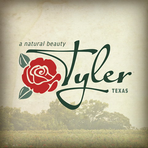
Above is the logo presented within the new expanded brand.
Below is Channel 19’s clip proceeding Tyler’s city-wide press conference where they unveiled the new brand.
This has been an exciting project for us and possibly one of the funnest in our 25 year adventure. We love Tyler, we’re designers and sure – we wanted our city to have a cool look. But this identity is critical internally and externally. We needed to help our client brand Tyler in a way that would help them bring in new business. To do that we needed a mark that created the right experience.
Since more information is picked up by the heart than the head, we helped define visual language that positioned Tyler as warm & friendly, inviting… as having a sense of history and as being a small city with a big city mentality.
We chose a script font for “Tyler” to convey it’s personality: Tyler is genuine, friendly, personal. And script fonts are essentially the type equivalent to cursive handwriting. Thinking in those terms, we created a signature for Tyler.
As for the rose… well, it may not come as a surprise to some of you but… Tyler owns the rose, locally and nationally. It was important to us to maintain brand consistency. Building on Tyler’s history and heritage was a natural. However, this time around, we chose to simplify the rose by shifting the view from profile to 3/4 view. It’s easily recognizable, more iconic. The pedals are now separate, open and inviting. This says something about the community.
Interestingly, we also designed the previous logo in 1998. It was also charming and nostalgic, invoking the values and character of the city but… it was time for an upgrade. And how many knew – Craig actually designed the logo before that one in the 1980’s! Watch the TV clip.
Thank you City of Tyler. We are enjoying this project so much… especially the spin-off ads and billboards and brochures. Too much fun.
HIW